
The Ichimoku Cloud, developed by Japanese journalist Goichi Hosoda, is a technical indicator that shows support and resistance levels, as well as momentum and trend direction. It provides more data points in comparison to the standard candlestick chart. Though it may initially look complex, if you know how to read charts, you’ll find it simple to understand with clear trading signals.
What is the Ichimoku Cloud?
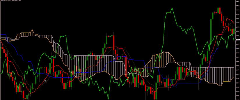
The Ichimoku Cloud is a technical indicator that is made up of five lines on the price chart. The ‘cloud’ will form between two of these lines (known as the Senkou Spans). First, let’s look at the Tenkan and Kijun Sens lines.
Tenkan Sen: this is the sum of the highest high and the lowest low divided by two. It is calculated over the previous nine time periods.
Kijun Sen: this is the sum of the highest high and the lowest low divided by two. Although the calculation is similar, the Kijun takes into account the past 26 time periods.
Senkou Spans: there are two types of ‘leading’ lines: Senkou Span A y Senkou Span B.
Senkou Span A is the sum of the Tenkan Sen and the Kijun Sen divided by two. This is then plotted 26 time periods ahead of the current price action.
Senkou Span B is the sum of the highest high and the lowest low divided by two. This calculation is taken over the previous 52 time periods and is plotted 26 periods ahead.
The area between the two lines on the chart, once these are plotted, is known as the Kumo or cloud.
The last part of the Ichimoku is the Chikou Span. Plotted 26 periods behind the price action, the Chikou is an indicator of market sentiment that is calculated using the most recent closing price. This feature shows the prevailing trend in relation to current price momentum, suggesting the market’s sentiment.
The interpretation is simple: when sellers are dominant in the market, the Chikou span will remain below the price trend while the opposite occurs on the buy-side. When a pair continues to be attractive in the market, the span will rise and remain above the price action.

How to Calculate the Ichimoku Cloud
The highs and lows are the highest and lowest prices seen during the time period. For instance, the highest and lowest prices observed for the conversion line over the previous nine days.
Adding the Ichimoku Cloud indicator to your chart will do the calculations for you, but you can calculate it manually by following the steps below:
- Calculate the Conversion Line and the Base Line.
- Calculate Leading Span A based on the previous calculations. Plot this data point 26 periods into the future.
- Calculate Leading Span B and plot this data point 26 periods into the future.
- For the Lagging Span, plot the closing price 26 periods into the past on the chart.
- Colour the area between Leading Span A and Leading Span B to create the cloud.
- When Leading Span A is higher than Leading Span B, colour the cloud green. When Leading Span A is lower than Leading Span B, colour the cloud red.
- Repeat the above steps for each period to create new data points. Connect the data points to each other to form the lines and cloud appearance.
What does the Ichimoku Cloud tell you
By using averages, the technical indicator shows relevant information quickly. When the price is above the cloud, it indicates an upward trend, below the cloud it’s a downward trend. And when the price is in the cloud, it’s trendless or transitioning.
When Leading Span A is increasing and above Leading Span B, this helps to confirm the uptrend; the space between the lines is usually shown in green. When Leading Span A is declining and below Leading Span B, this helps confirm the downtrend. The space between the lines is usually coloured red.
Depending on where the price is in relation to other areas, traders will often use the Ichimoku Cloud as an area of support and resistance. The cloud provides support/resistance levels that can be projected into the future. This distinguishes the Ichimoku Cloud from many other technical indicators that only offer support and resistance levels for the current date and time.
Traders should use the Ichimoku Cloud together with other technical indicators to maximise their risk adjusted return. For example, the indicator is frequently paired with the relative strength index (RSI) to confirm momentum in a particular direction. It’s also important to consider the bigger trends to understand how smaller trends fit within them.
For example, during a very strong downtrend, the price may push into the cloud or slightly above it, briefly, before falling again. Only focusing on the indicator could mean you miss the bigger picture that the price was under strong longer-term selling pressure.
Crossovers are another effective way to use the indicator. Look for the conversion line moving above the base line, especially when the price is above the cloud. This can be a strong buy signal. One option is to hold the trade until the conversion line falls back below the base line. Any of the other lines could be used as exit points too.
The difference between the Ichimoku Cloud and Moving Averages
While the Ichimoku Cloud uses averages, they differ from a typical moving average. Simple moving averages calculate averages based on closing prices, add them up, and divide that total by the number of closing prices. In a 10-period moving average, the closing prices for the last 10 periods are added up, then divided by 10 to get the average.
The calculations for the Ichimoku Cloud differ. They are based on highs and lows over a period, divided by two. Ichimoku averages will therefore be different to traditional moving averages, even with the same number of periods.
Note that one indicator is not better than another as they all provide information in different ways.

Limitations of using it
The Ichimoku Cloud can make a chart look busy with so many lines. To solve this, most charting software allows you to hide certain lines. For example, you can hide all the lines except for Leading Span A and Leading Span B, which create the cloud. You should focus on which lines give the most information and consider hiding the other lines if they are distracting.
An additional drawback of the Ichimoku Cloud is that it is based on historical data. While two data points are plotted in the future, the formula is not predictive. Averages are just being plotted in the future.
The cloud can also become irrelevant during long periods of times when the price is way above or way below it. At times like these, the conversion line, the base line, and their crossovers become more important, as they tend to stick closer to the price.
Conclusión
To create a “cloud” indicating potential future resistance or support levels, the Ichimoku Cloud plots multiple averages on a chart. This reveals not only support and resistance levels but also trend direction and momentum, all of which appear as a group of technical indicators. While the Ichimoku Cloud has some limitations, it is neither better nor worse than existing technical indicators such as moving averages. Essentially, it represents information in a different way.
Descargo de responsabilidad:
Esta información no se considera asesoramiento ni recomendación para invertir, sino que es una comunicación de marketing